Website Heatmaps
Do you want to know where users click on your website, how they browse through it, what catches their attention and what doesn’t? Would you want to see it as a picture rather than a series of charts that are usually difficult and hard to understand?
Then website heatmaps are a perfect solution for you, as they will help you achieve just that.
What is a website heatmap?
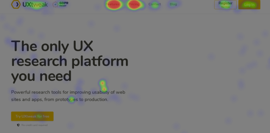
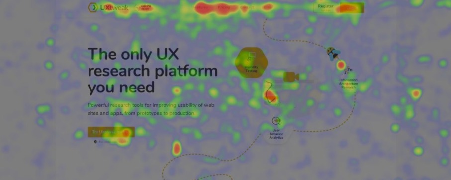
Website heatmap is a visual representation of any user’s activity on your website. It allows you to see where they click, scroll and how they move on your page. With heatmaps you can see all user’s activity as if you were them and analyze it to make useful improvements.
It’s an extremely useful tool for usability testing and research and here’s why.
A heatmap is used in web analytics to overlay a snapshot of a page. It can illustrate which areas of the page were the most popular, which ones drew people in, and how the percentage of visitors reduces as they scroll down the page. The “heat” is a spectrum of color that portrays the intensity of the user’s activity.
The warmer the color is (orange, red) the more heated is the area, meaning ussr spend more time on it, clicking and scrolling through. There are many different types of website heatmaps, so let’s take a closer look at each of them.
Types of website heatmaps
- Click maps
- Move maps
- Scroll maps
Click maps
The most common type of heatmaps that we are all familiar with. They highlite users clicks or taps, if we are talking about mobile. The most click areas usually appear in color red, when the least clicked ones are green. By moving through the heatmap, you can also see the number of times that users clicked on an item.
This type of website heatmaps is perfect when you want to learn if the users are clicking where you want them to.
Scroll maps
Scroll maps are visual representations of how far down visitors have scrolled. A typical scroll map resembles a rainbow, with red at the top encompassing the entire visible region of the page. Then, as the percentage of those who scrolled lower and lower gradually drops, the color becomes colder.
Move maps
Because smartphones and tablets lack a cursor, these maps are only useful on desktop computers. A lot of individuals use the cursor to point to what they’re looking at the moment. Indeed, research shows a link between cursor and gaze position, implying that motion maps are a suitable approximation for data obtained by eye tracking (a much more expensive technology that requires specialized hardware).
How to analyze heatmaps?
The first thing you need to do is to clearly define your goals and what type of information you are expecting to get from the heatmap analysis. Define a hypothesis and then validate it with the results of your study. It can be anything (visitors clicking on your new feature, subscribing on the newsletter or even converting).
Ones you are ready with the goals, the analysis will be a piece of cake, if you’re using the right tool.
Here are the answers you should look for:
Are my CTAs working? Do people click on them?
You can try and fix it by making them more visually distinctive or changing the labels/content. Or use the heatmap as a basis for user testing (for example, to see if people don’t click an element because they don’t find it interesting or because they don’t understand it) depending on the situation. You can compare heatmaps after an update to see if the problem has been resolved.
Do people click on the non-clickable elements?
The polar opposite of the previous point. The design of a page might sometimes lead people to click on items that don’t do anything. In the vast majority of cases, this signifies that people are anticipating a response. Here you may either change the element to clickable or change the way it looks so that users don’t try to click on it anymore.
Do they scroll down the page and if so, do they manage to get to the important information?
What people can’t see, they can’t interact with. And, despite the fact that scrolling is an inherent element of any website, many individuals are unaware that there is more to the page than what they are now viewing.
See if users get to the important information and if they even realize there is more to the page?
Are users paying attention to what they should be or are there too many distractions?
Average person’s attention span is quite low and it’s very easy to get distracted by certain elements. See if users are able to focus on what’s important and get rid of any useless distractions.
Want to know what is the best tool for Website Heatmaps ?
Check out our handy comparison of some of the best options on the market!